December 7, 2009
Tip: Invert Your Screen Colors for Easier Reading
In terms of web design, light text on a dark back ground can give some dynamic results. When it comes to reading on the web though, I prefer the reverse. What happens, especially when the scenario is white text on a black background, is that similar to looking into a bright light, the text can become "burned" into my vision very briefly. As I end a line of text and start to wrap back, the ghost text stays with me and takes a sec to fade away. Needless to say, it can make reading very unpleasant.
There are a few simple tricks I use to alleviate this issue.
- Write my own stylesheet for the browser with simple defaults to make the background and text reversed. Not my first choice as I usually want to experience the intended design first. Find out more about user stylesheets.
- Use the excellent Readabilty bookmarklet. I use this on most news sites to remove all the blinking ads. It's not prefect though. It has trouble saving the inline images and doesn't work with paged articles, which so many sites use to gain more ad revenue.
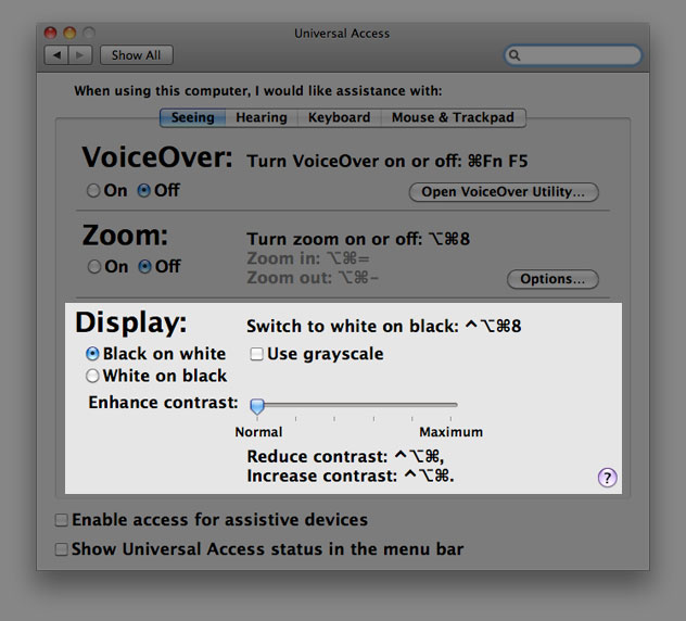
- Or the simple shortcut (on Mac only) of Control + Option + Command + 8. While it seems long it's actually pretty simple. This command can be toggled quickly and is therefore my favorite.
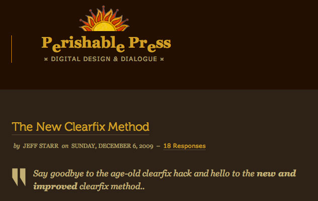
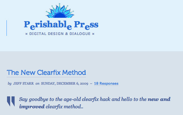
Example: Perishable Press, a well designed and excellent source of WordPress and general web development tips.
Before the key command:

After the key command:

And if you forget the key command you can always visits your Mac's system preferences and make the change.

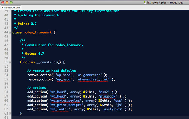
While this makes reading easier on the web, I actually use light text on a dark background when I'm coding. Seems counter intuitive but I've found it preferable. I need to think a bit more about why it makes such a difference...
Example using TextMate's Blackboard theme (modified):
