October 25, 2024

State of CSS 2024

The State of CSS survey is out and like every year, I get introduced to new features that I didn't know about, or ones that I've heard about but have yet to dig into.

Here are some features I'm excited about using:

  • backdrop-filter (MDN): Just started using this on my landing page to blur the background behind the text.

  • light-dark() (MDN): Using with custom properties will make it much simpler to manage themes.

  • subgrid (MDN): Been waiting on this for about 7 years.

  • :where() (MDN): Among other things (like not affecting specificity), this will allow for more concise selector lists.

July 1, 2024

React Hydration Mismatch Error

I've been using React/Next.js for a long time and should know this, but I went down a rabbit hole this weekend trying to figure out why a className wasn't able to be reconciled on the client during the initial rendering.

I've gotten the dreaded hydration mismatch many times in the past and it was always due to a bug, but in this instance, I didn't see it that way. I wanted a nested component's className to be "mobile-first" optimistic. The component should only be shown on small viewport. Hence, pre-render on the server as if it was in a small viewport. Once it renders on the client, update to the className based on the actual conditions.

React refused to make this reconciliation and I couldn't understand why. All of my searching only gave me vague and generic guidance, which was "this should be treated as a bug and fixed". I finally found the reasoning in React's hydrateRoot docs:

In development mode, React warns about mismatches during hydration. There are no guarantees that attribute differences will be patched up in case of mismatches. This is important for performance reasons because in most apps, mismatches are rare, and so validating all markup would be prohibitively expensive.

So basically, if your component has client-dependent conditions (like window.matchMedia) that affect its initial attribute state, it should return two separate trees: one for the server and one for the client.

January 7, 2013

A Couple Sketches Pushing My Buttons

I made these a couple of years ago and they've kept their spot on my studio wall through many sessions where I've pulled down things that either I've already absorbed or have lost my attention.

The first one (black mass) has evolved over time. The fact that I can still make out the original object behind the black is what keeps intriguing me. The second sketch was simply a test for different gel mediums.

The lack of registration between the yellow, blue and line drawing is what makes this one unresolved. Each layer on the paper reads pretty distinctly on their own. But they create an implied total object when taken as whole. That they're not trying very hard to interact, but still affect the whole more than I would have expected is what is so surprising to me. This goes for the black sketch as well.

This is where I'm at right now, trying to build objects from disparate parts that still have some interesting attributes when taken individually.

I plan on updating my portfolio with the work I've made in the past few years. I've shot most of it, just in the middle of moving this site to a new platform (WordPress -> Jekyll). I'm halfway there.

December 20, 2012

Sketching Basic Shapes

Needed to quickly get some shapes out my head.

Either it's a gouache limitation in general or the brand I'm using has issues. The cool hues I have simply require layering to get to the same opacity as the warmer ones.

December 22, 2011

In Progress

Small drawings on paper (in progress and not necessarily right-side-up).

Just a quick post to show some of what's been going on lately. I've been on vacation for the past week, trying to spend most of it in the studio.

Not much to say otherwise, except that things are starting to come together.

November 30, 2011

Easy Syncing of GitHub Pages

I’ve started using GitHub more and more recently as I’m finding Git’s steep learning curve, as compared to SVN, outweighed by GitHub’s usefulness and flexibility. One of those factors is GitHub’s “Pages” feature. From the docs:

The GitHub Pages feature allows you to publish content to the web by simply pushing content to one of your GitHub hosted repositories.

For example, I’ve recently started a repo to begin adding the many miscellaneous tests, POCs and demos I create during the course of development. Instead of requiring someone to download the repo just to see the examples, I use GitHub Pages to host the rendered version (when applicable). The “Mimicking Links” page is the first one I’ve published.

GitHub makes this automatic when you create a branch of your master named gh-pages. Any time you push to gh-pages, the results are published. Easy enough, but I quickly realized that I needed a way to mirror all changes on master in gh-pages without constantly having to type:

git checkout gh-pages
git merge master
git push origin gh-pages
git checkout master

Some quick searching turned up Oli Studholme’s helpful post “GitHub Pages and deleting git’s master branch”. He outlines his own attempts (and suggestions from the comments) and what finally worked for him. Since he had more requirements (deleting the master branch), I wanted to post exactly what I’ve ended on.

First, create your local repo and add it to GitHub.

From the command line, navigate into the root of your repo and run following block of code as referenced in the “Project Pages” section of the GitHub Pages docs (make sure you have no changes waiting to be committed):

git symbolic-ref HEAD refs/heads/gh-pages
rm .git/index
git clean -fdx

Now that your working directory is clean, merge in the master branch and push gh-pages to GitHub:

git merge master
git push origin gh-pages

You can now visit the url http:username.github.io/yourRepo/ to view the results (the first push may take a little time to show your changes).

Now that your pages are in place, you’ll want to automate the merging1 to gh-pages any changes you commit in master.

To do this, open the post-commit.sample file located in yourRepo/.git/hooks and replace its contents with the following, saving it as post-commit:

#!/bin/sh
# Mirror master in gh-pages
git checkout gh-pages
git merge master
git checkout master

This block will run after every commit you make to the master branch (you’ll see the output on the command line).

All that’s left to do is push both branches to GitHub any time you've made a commit:

git push --all

I’m still pretty new to Git/GitHub, so any suggestions or corrections are appreciated.


Footnotes

  1. Oli’s post suggests rebase, but I’m sticking with merge as I understand it better.

November 17, 2011

Printing

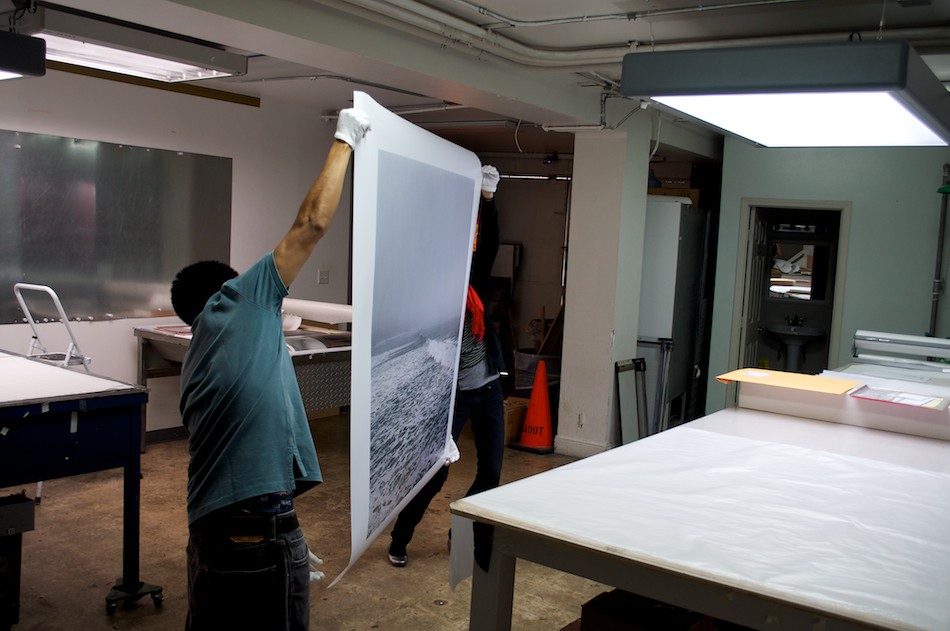
Flipping the print

Flipping the print over so it could be rolled up and placed in a tube for the trip to the framer.

I'm in the process of getting negatives drum scanned for a new body of work that will be comprised of a series of large-scale (at least 48"x48") composited images. This will be the first time I've used photography and Photoshop in my work, which has primarily been sculpture.

I've been making photographs as a hobbyist for a long time, but until recently, Photoshop was mostly an application I used for minimal photo editing and turning designs into web pages. Tools like layer masks, layer adjustments, blending modes, brushes, and most of the other 8 million options were of no use to me. Now that my needs have changed, I've been going through a crash course on workflows and tools needed in photo compositing. This also involves getting used to a tablet, which is necessary (and so much easier) in this type of work.

The best technical information I've found has come from a video series named "Calvinize: Signature Techniques of Photoshop Artist Calvin Hollywood" (he also has some short tutorials on youtube). It's mostly concerned with beauty retouching, but the technical information definitely applies to my project. Plus, with a great German accent, lively narration and a lot of skill, Mr. Calvin easily beats out the drones in the other series I've tried.

Since I have no experience with large-scale printing, I wanted to go through the process before printing anything from the series. I decided the perfect candidate was a photo of Sunset Beach on a glooming morning, one I've wanted to print since the first time I saw the proof sheet. If you've clicked on the image, you'll immediately notice the terrible reproduction I was able to eek out of my flatbed scanner. While the scanner is on the low-end (Canoscan 8800F), it's usually pretty good with most images, at least for the web. It turns out that the negative had some issues. After drum scanning it, the nice folks at The Icon told me it may have been mishandled at some point, either while loading the camera or unloading the finished roll. Makes sense, I was still getting used to loading a Hasselblad when I used it to shoot the photo a year ago. Luckily their scan was nowhere near as screwed as mine and they were skillfully able to work out the issues.

So yesterday, after a few interesting and informative proofing visits earlier in the process, I picked up the print and dropped it off at the framer. It was definitely more stressful than I'd have guessed. Transporting anything I've spent so much time and money on is always stressful (including cats). And my imagination made sure I'd think about all the mishaps possible in a short drive across LA. Elizabeth helped to keep things in check, though.

The print looks great and I can't wait to get it back from the framer and on the wall (3 weeks, as they're crazy busy). More importantly, I now understand the process, as well as what to expect in the final output, something I've needed in order to feel comfortable enough to keep moving forward.

September 1, 2011

Hyphen, CamelCase, or Underscore

My choice of word combination patterns depends on the language. I initially tried to use a one-size-fits-all approach, but as my projects became more complex with multiple languages, it got really annoying when the pattern did not match the language. The old standby argument of "readability" quickly loses its validity when you're dealing with code. For instance, PHP can contain javascript, html and css and uses underscores for functions. Depending on your text editor syntax hi-lighting, a javascript function (camelCase) could use the same coloring as a PHP function (underscore). Since you can't depend on color alone, using each language's pattern enables you to immediately know the difference.

There will always be edge cases (PHP uses CamelCase for classes), but I find that sticking with each language's word combination patterns make for the least friction possible.

With that said, here are my current choices:

PHP Variable: underscore Function: underscore Class: CamelCase

Javascript Variable: camelCase Function: camelCase Constructor: CamelCase

CSS Class: hyphen ID: hyphen

HTML Custom Attributes: hyphen

With html, the data- prefix is one defense, even though attributes like tabindex differ. Also, an underscore is technically meant to augment a letter or word, while a hyphen is used to separate words or syllables.

Regular Expression engines use the same characterizations.

For example, using the text "some-word some_word":

with the regex matching pattern:

\b\w+\b

the resulting array of matches is:

['some', 'word', 'some_word'];

This may seem like I'm over-thinking things, but like I said, I want the least amount of friction when I work.

August 24, 2011

To Be, or Not to Be, an Anchor

In reading Chris Coyier's response to a reader's question on when to choose an anchor element over some other element when creating javascript-driven experiences, I realized that only recently did I form a concrete opinion on the matter. My response originally started as a comment on Coyier's post, but quickly turned into a full post of its own.

Here's the part of Chris's response with which I identified most:

If the app is totally JavaScript dependent all behavior is attached via JavaScript, I guess it doesn't really matter what element you use.

Until recently, I would have given the same answer. For the past year and a half I've been part of a large team working on the rewrite of a major ecommerce site that required full accessibility for blind, low-vision and cognitively disabled users. Being a javascript-heavy UI, it required a lot more effort in discerning the semantics of an HTML element.

I plan on writing a lot more about that experience, but right now I want to respond specifically to the question of when to use an anchor element.

The reader says that he generally used the a tag liberally to represent an element as clickable.

In brief, that's the safest choice. But the natural inclination of a developer (ideally) is to dig as deep as possible and make the most informed choice. After all, their the ones who have to support it when things get wonky.

If you decide on something other than an anchor though, just make sure the element you choose is accessible to keyboards and screen readers. Easy. Done.

Of course, it can be a lot more complicated than that. Anchor elements are natively focusable and screen readers provide functionality for navigating a page by its anchors. This allows to users to quickly scan the page via their keyboard. Visual users often (and understandably) take for granted their ability to visually scan a page since it's a natural response and not specific to viewing a webpage. But, substituting a different element can require a lot more effort in facilitating a equal experience to non-visual users.

Using tabindex with a value of 0 on a non-natively focusable element will allow for the element to be navigated via the tab key, and in the order of the natural document flow. But the catch is that a screen reader will not include the element in its anchor shortcut feature. This may not be necessary if the the element's purpose would not make sense outside of its surrounding context, like a tooltip, for example.

More importantly though, the screen reader will not speak the element as a link. Visual users employ visual clues to interpret actionable elements in a page. Screen readers rely on semantics. While a visual user can instantly recognize a button by its design, a screen reader can do so only if a button element is used.

Also, it's good to understand that title attributes are not necessarily spoken when a screen reader user is focused on an element that contains one. The popular screen reader JAWS provides this as an op-in preference. So using a span as an actionable element will need both a title attribute and screen-reader-only text (off-screen) to communicate to the user the purpose of the element.

Ultimately, an anchor element provides users an actionable element that's accepted as a means to navigate information. Regardless of whether the navigation happens via a full page refresh, asynchronously, or with javascript turned off, the underlying meaning remains the same. Using it liberally is a good choice.

Update: 8.24.2011

Regarding ARIA, support is getting better, but it's still pretty spotty. In fact, I’ve had to remove ARIA attributes at times because of screen reader conflicts. It can also change how the user's screen reader interacts with a page (Form and Application modes). This can be disorienting to a user who has yet to master the full feature set of their screen reader. But after reading Dave's comment below, I figured I should give the link role a try. I use the role when it's useful, but the link value is one I've never considered.

I used the following markup for my quick test:

<span id="link" role="link" tabindex="0">Test Link</span>

Surprisingly, JAWS 12 with IE8 spoke the element as a link. I was also able to navigate to it using the u key shortcut (navigates unvisited links). The v key did not register it as a visited link even though it had been clicked. That makes sense since there's no href. Good to know.

Update: 11.8.2011

I’ve put up a page of various attempts to mimic links. Not exhaustive, but should be helpful in drawing general conclusions. I’ll add to it as I get more examples and time.