September 8, 2009
I've been doing a lot of drawing/painting lately. It is definitely a new experience for me. I first started out thinking that everything I began was going to have and end, that is, a mostly successful end. Instead, I've learned that everything has a peak at which point I have to make a decision about whether to keep going, or not.
At first I just kept reaching these peaks, recognizing them and then trying to further elaborate in the hopes of finding some plateau that reached throughout the dimensions of the paper. This lead to a lot of paint-overs with nothing to look to for guidance on aspects that were working. I finally let go of my original assumption. The following sketches represent small successes that I want to keep as reference for the next works.
Though these have many shortcomings, I wanted to write about as to what I feel is working.
Btw, I'm not all that great at photographing flat work as most of my experience is in 3D. Gonna brush up on it, pronto.

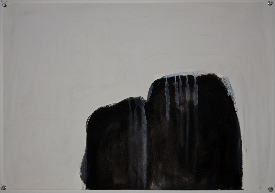
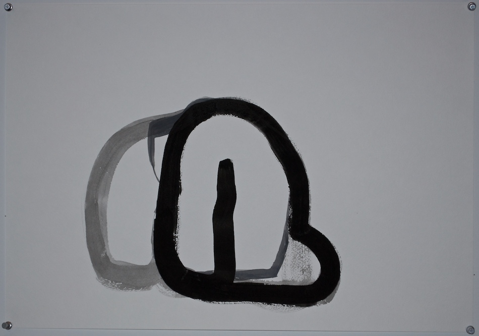
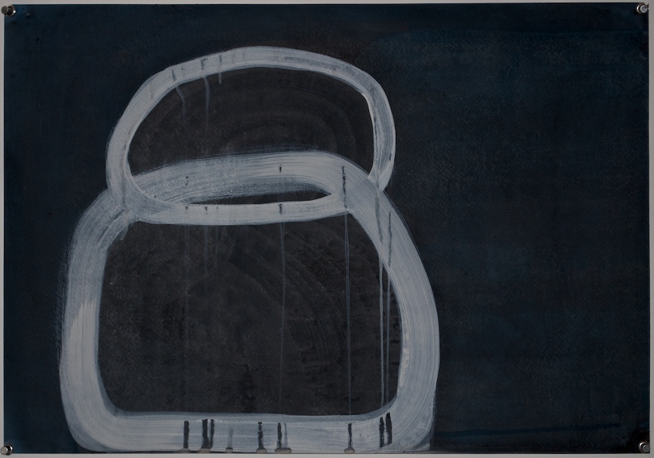
What I've found the hardest is giving edge to a form. The above represents some small success towards that end. I spent a lot of time redefining the edge while leaving traces of the previous attempts. The bottom of the left hump shows this the best.

The different densities of black and the the white seeping into/onto the form start to give it some volume and weight. I also like the simplified handling of the edge.
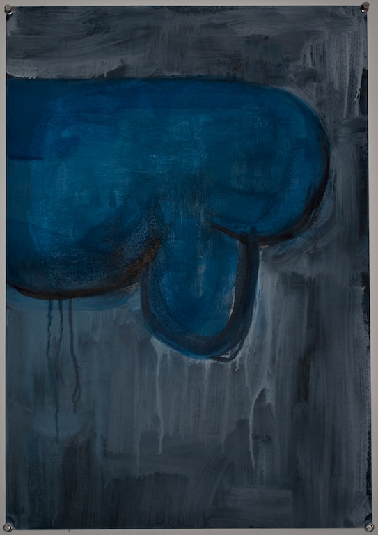
The wetness of the paint is something that I found to be pretty exciting. Having to deal with a vertical working surface has added some limits that forces me to be more strategic in how I go about things.

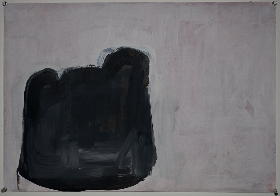
A little more edge articulation. I'm starting to really like painting wet on wet. When I start making marks I can feel a distinct window before things get muddled.

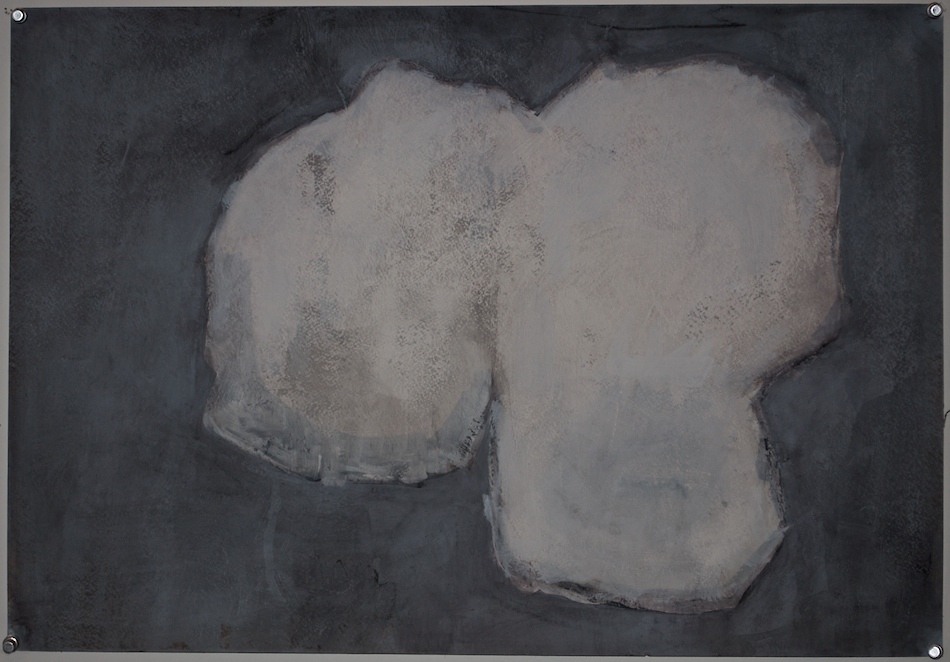
I've been putting 6 or 7 blank sheets on the wall and making some marks to get the ball rolling. This one sat a long while until I was ready to add to the initial marks. The next attempt (the dark marks) had so much going on that I put it aside. The way the light marks relate the dark gives the whole a weight and clunkiness that's just right.

Cartoonishness is a delicate balance for me. While I feel this a bit too far (and belies my influences), I was able to restrain it.
The figure ground relationship feels more solid here as well.

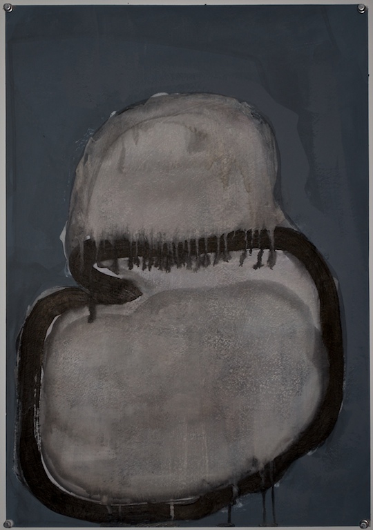
This started out in the same vain as the first image. In dividing the white form I was able to create an outside section that appears to be resting on the section outlined in black, all the while acting as one form.

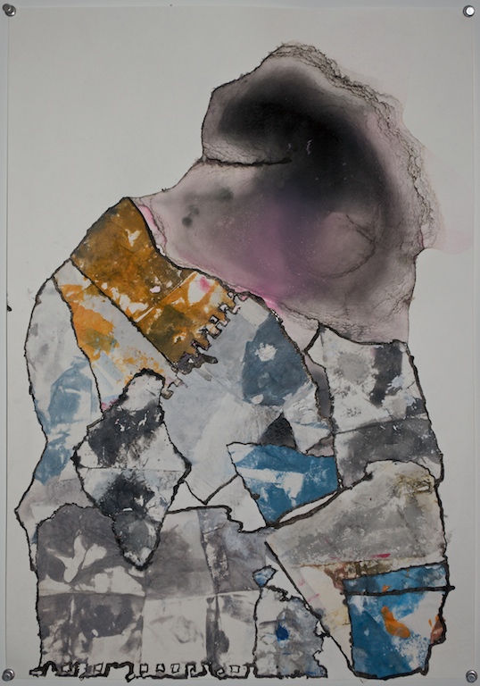
Completing the top form with collage. This is something I want to do more of.

More balancing of the cartoonishness. A lot more restrained with simple oval forms interlocking to create weight. Trying some pattern on the inside as well. This adds to the effect of weight but becomes simply a pattern when looked at directly.

